What I Learned Making My First Twine Game
Tips and tricks to help you create your own game

If you want to get into the profession of game development, the first thing folks in the industry will tell you is to start making games. Fortunately, there is an abundance of tools available for artists, designers, writers, and other creators to dive into the process and craft of making games. The first games you create don’t have to be perfect, nor do they even have to be good. The point is to just learn from your successes and failures, and then continue making games.
My journey into making games comes from my passion for storytelling. I’m fascinated by how games can create unique interactive narratives that cannot be experienced in a strictly linear format. When I thought about making my first game, I wanted to draw on my existing skills as a writer and create a text-based game built that allows the player to make choices as they move through the narrative. Hoping it will help other first-timers, here are a few of the lessons I learned on the journey of making my first game, Bluebeard: An Interactive Tale.
Twine Basics
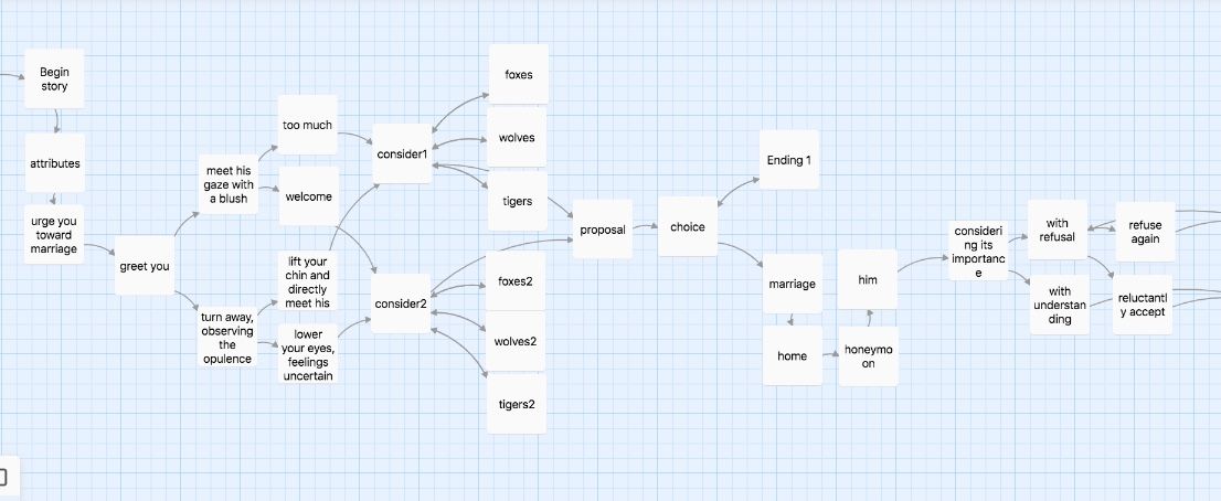
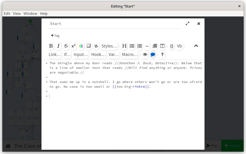
Twine is an open-source tool designed for the development of interactive fiction and text-based games. Jumping into Twine is incredibly simple, involving the creation of cards with text and hyperlinks that connect to other cards. We can edit the visible appearance of the cards and text with the markdown system (requiring only a minimal understanding of code).
This allows the developer to create branching narratives and dialog, forming strings of choices that can lead the player down various pathways that can lead to multiple endings. These choices can be as simple or as complex as the writer or developer would like.
For those interested in diving deeper into the code, Twine also has several other features that allow developers to further imbue their game with interactivity and creativity. This includes introducing variables or randomization into the game (as just a couple of examples). The Twine Cookbook provides detailed explanations of how to use the tool.
For the purposes of making my first game, I wanted to keep the scope of the project relatively small. Therefore, I kept the overall design as simple as possible, so that I could primarily focus on storytelling and choice selection.

Working Under the Illusion of Choice
When designing an interactive narrative, one question that needs to be answered it how deep into the choice tree do you want to go? At first glance, it might seem like the best option is to give the player as much choice as possible. However, more choices mean more work, and as the number of choices increases, the project can quickly spiral out of control and become unfeasible for the designer.
This is why most developers operate under the illusion of choice, which I went into more detail about in another article. The idea is to offer choices that feel meaningful while maintaining an impactful and carefully controlled story. Narrative adventure games such as Oxenfree (Night School Studio), The Walking Dead (Telltale), and the Life is Strange series (Don't Nod/Deck Nine) all use this concept in shaping their interactive adventures.
As a part of keeping the scope of my project small, I decided on two things. First, I wanted to work with an existing story I already knew well. Two, that I wanted to provide choices that felt meaningful, but otherwise limited so that I could complete the game in a reasonable timeframe.
The first I was able to decide quickly. Fond of fairy and folk tales, I used the classic French tale Bluebeard as a jumping-off point. The story—about a young woman who marries a wealthy man, only to discover he hides a deadly secret—was a tale that I knew well. I had even written and published a retelling of the folktale, called How Bluebeard Ends, which envisioned various endings for the original tale, had the heroine made different choices along the way.
Since I had already imagined several endings for Bluebeard through my fictional adaptation, I assumed it would be simple enough to fill in the narrative and choice selections leading to those possible endings.
I was wrong.
Having the endings built in and building the story around them felt similar to constructing the infrastructure for a pre-existing roof—or in this case, many roofs. Building the floor plan of the story within this constraint meant that it limited me on the pathways I could write. That’s not necessarily a bad thing, of course, as limitations can often make space for creativity.
For the early section of the game, I worked with a Walking Dead-style choice structure, in which choices branch off and then return to the core of the main story (as seen in this graph of the choices throughout the Walking Dead game). This allowed me to progress the player through the opening and middle of the story, before reaching the last confrontation, which leads to one of the three main endings.
During constructing these branching threads, it became quickly clear that several of the endings I had originally crafted in my published short story would not work for the game, as they would likely be unsatisfying to the player. In addition, several existing endings had to be reworked and adapted to suit the new flow of the playable tale.

Using Cards, Fonts, and Color for Additional Impact
When you’re working to craft interactive fiction in Twine, the text itself is the star of the show, with the prose, dialog, and choice options being the primary means for the player to move through the narrative. However, there are subtle ways to shape the visual experience to support the tone and emotional impact of the game using the existing tools.
Length of Cards and Passages
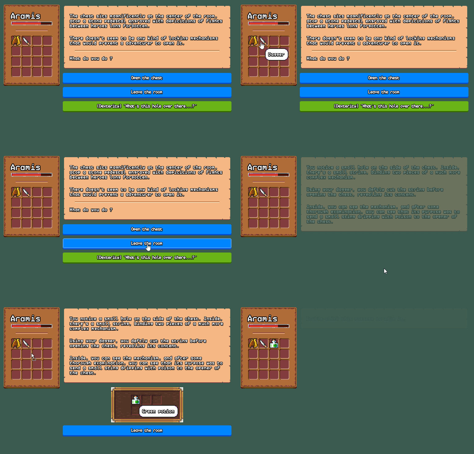
As mentioned, a Twine game comprises cards with text and interconnecting links. This text can appear on the page in a variety of ways, with the text being animated or having transitions (such as having the new text appear below the previous passage to create a scrolling effect). For my purposes, I went with the simplest method—which involved using standard, static cards with each link jumping between them.
Even using the standard style of cards, there are some simple ways to affect the pacing and tone of the game. For example, the use of longer, bulky paragraphs can seem dense and overwhelming to the player and may cause them to skim over the information instead of paying attention to every word. Such paragraphs can reflect the experience of something like a corporate executive dumping a bunch of jargon that neither the main character nor the player wants to give much attention (for example, The Writer Will Do Something uses this to significant effect).
On the other hand, shorter passages with quick, snappy paragraphs are easier to read and evoke a more rapid pace, moving the player more quickly through the text. This is how I approached my game, creating shorter cards with brief paragraphs on each one.
I also thought about each card as a single page of text, with the link to the next passage acting in a manner similar to a “page turn.” In comics, the page turn is a function of the reader turning the page—and comics creators often attempt to craft their pages to provide just the right balance of information and mystery to get the reader to turn the page. Or with the beautifully horrifying manga of Junji Ito, the page turn can be used to surprise the audience, with the physical act of turning one page to the next providing just enough mental pause for the reveal to be truly shocking (which is explained wonderfully in this video on How Media Scares Us).
I do not pretend to be nearly as skillful as Ito or any of the other comic artists crafting phenomenal page turns in their work. However, I did consciously consider the length of each passage and the placement of the choices and links to create just enough mystery to guide the player to want to move forward.
Font & Color
Beyond the length of the passages, the selection of font and color are excellent ways to add emphasized tone, character, or setting in a text-based game.
Different fonts have distinct personalities, with serif fonts (Baskerville, Times, etc.) providing a more traditional feeling, sans serifs (Helvetica, Verdana, etc.) evoking a more modern feel, and cursive scripts feeling more classical. In most cases, it’s best to select a standard serif or sans serif font for the main body of the text, as they are easier for the player to read. We should only use more elaborate fonts for headings, as they can be more challenging to read.
We can also change both the background and the font color. A creamy background color with a black or dark brown font can give the sense of reading an old letter or manuscript, while a vibrant color on a black screen can reflect the use of technology. For example, Textventure: Mars uses bright yellow text with a computer-styled typeface to evoke the sense of reading a futuristic computer screen on a spaceship.
When choosing what colors to use, I highly recommend using a color palette generator to ensure the colors feel cohesive (such as this one). Another important aspect of color selection is to make sure that the background color and text color are in high contrast to each other to ensure readability.
For my game, I primarily used the standard white text on a black background, with the links in bright pink. However, at certain points in the narrative, I wanted to reflect a significant tonal shift, so I switched the background color to reflect that change—and hopefully provided a sense of surprise.
Sometimes You Need External Motivation
Most developers are not lucky enough to make games full-time, so they end up creating them in the time they have available in and around day jobs and the obligations of their daily lives. As a result, the development period for even minor games can stretch out along inordinately long time periods. After a while, it can feel like the game will never get done.
Having external motivation can be incredibly helpful for keeping the project moving forward. If you’re working as part of a team, this can mean setting up weekly meetings or some other means of regularly checking in. Or, if you’re working solo (as I was), this may involve joining a game jam or connecting with other solo creators, who can help set deadlines and hold you accountable.
For me, the key motivating factor toward completion was the “Finish It” Narrative Game Jam, which tasked creators to finish an incomplete narrative project in the time frame allotted. This was exactly the kick in the pants I needed, pushing me to hunker down, finalize the draft, and go through several rounds of editing and testing before calling it done.

You’re Not Done When You Think You’re Done
Completing the game is not necessarily the end. Any perusal of both AAA and indie games news reveals that most developers release updates to their games following their release.
When you're working closely on a project, it's not always possible to see all the glitches and pitfalls. Players (outside your immediate circle) experience the game with fresh eyes and may notice things you overlooked.
When I shared my game with players for the first time, I generally received positive responses. However, there were some differing opinions on some of the early endings within the game, which I dubbed “Overearly Endings” to differentiate them from the three “Main Endings.”
One player noted that the Overearly Endings evoked a sense of ludonarrative dissonance, the feeling that the story conflicted with the player’s actions or choices (which was a new concept for me). For them, these early endings (in which the character is opting out of the fairy tale narrative by escaping the game before the main conflict) represented the “correct” choices for the characters, but because the game allowed the player to go back in and make another choice, it implied that the option was “wrong.”
Another player commented, however, that they liked this element of the game, as it reflected the fairy-tale element of the story, in which the conflict has a natural sense of inevitability.
It was an interesting and unexpected response, and I spent a significant amount of time pondering what to do about it (in fact, I’m still pondering it). My options were twofold. I could leave the game as is, or I could go in and remove the Overearly Endings and have the game start later. Both options were valid and had their pluses and minuses, and I even considered creating two versions of the game, one with and one without the early endings.
In the end, I decided to leave the game as I had written it. Every project is going to have things that work and don’t work for other people. As a fan of fairy tales and folklore, I enjoy the tone of such stories and the feeling of inevitability that plays into that concept. Since this aligned with my original vision, I kept the endings as they were.
Always Backup Your Work
I’ve always known that it’s vitally important to save and back up your work and am generally great at remembering to do so, but Twine lured me into a false sense of security. Twine has both a downloadable and a browser-based version. I worked almost entirely within the browser, and since Twine automatically stored the data in the browser, I assumed everything would be safe.
However, Chrome performed an update recently, and that update wiped my entire browser history—and all my Twine data along with it.
Fortunately, the game is completed, and the HTML version is safe. However, I have no backup of the raw game data, nor do I have the bulk of the text saved in a separate document. Some googling shows that there are converters out there that can transition the HTML file to an editable Twine file. Without that, I would have to rebuild the game from scratch.
The next time I work with Twine, I will absolutely use the Archive function to regularly save the raw data, so that I can reload the work as needed in case anything goes wrong.
Final Thoughts
Making my first Twine game was a fascinating experience, one that revealed a few of the pleasures and challenges of constructing an interactive narrative—challenges that I would be delighted to take on again. I’m already looking forward to crafting my next Twine game and incorporating some lessons I’ve learned along the way and taking on new challenges, such as incorporating variables to make the interactive narrative even more game-like.
Bluebeard: An Interactive Tale is available to play for free in your browser. If you’d like to share your experience of playing the game, please leave a comment or reach out to me on Twitter.
