The Art of the Pixel
A look inside the process of renowned pixel artist Alex Kubodera

This was originally an interview published in Edge Magazine’s 2016 Special Edition: The Art of the Pixel. I was traveling in Vienna at the time and answered these questions sitting at a café in the MusiemQuartier flanked on either side by, well, museums. So needless to say I was feeling particularly inspired and self-important. All I was missing was a beret and a cigarette. I was lucky enough to be included as 1 of 24 artists, and it definitely is a highlight of my career. I’ve kept it unedited as it appears in the magazine so it’s true to the time of writing - with just a cigarette puff of pretentiousness.
If you bend the fore-edge of the magazine one way it shows Link, and if you bend it the other, Mario. Definitely worth picking it up just for that.

SJ - Why do you create pixel art? What is the appeal to you?
Pixel art had never crossed my mind before Sword & Sworcery (S&S). It was the first time I saw a commercially successful game shun graphical fidelity for a unique style, and subsequently brought about a renaissance of pixel art to the industry. In a way, pixel art is impressionism for games. The essence of your design has to be distilled into as little space as possible, and even then, what you portray is open to interpretation. There is something poetic about that, despite the rigidity of pixels. What started as a technical limitation for our two-man team, became a powerful tool of expression.
SJ - How long have you been creating art such as this? How did you get started? Has your approach changed over time? If so, how?
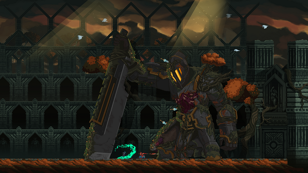
My foray into pixel art began around 2013, attempting to adapt the S&S style into a different setting. Up until then, I had focused on detailed character illustrations, and was ironically finding it difficult to scale down those design elements. It wasn’t until the end of 2014 when I started working on Death’s Gambit that I really delved into pixel art. My process has always been painterly, chiseling swathes of color on a blank canvas. It starts with feeling out the space, slowly sculpting silhouettes, and then defining color schemes with depth and parallax layers. Two things I’ve become more conscious of are contrast and “3D” angles. Contrast is key for keeping the sprites simple and limiting the number of colors, while giving it a sense of form. Utilizing angled architecture is great for pushing the depth of a scene and breaking up the 2D plane.

SJ - How would you describe your style, and how did you settle on it?
The term I hear most often when people see Death’s Gambit is “detailed”, so I suppose that’s my style. The dark gothic aesthetic necessitates that level of intricacy, as does the tremendous scale of our world. When you use a free-form camera that pulls in and out to extreme lengths, you can’t leave areas one-dimensional, or single color. The entire scene has to be detailed enough for the closest zoom of the camera. We weren’t keen on being labeled retro, so we pushed the style to be as “modern” as can be with pixel art, and that entails breaking some pixel-purist rules; utilizing gradients, ignoring palette limitations, and anti-aliasing for example.
SJ - Where do you get inspiration from?
Inspiration comes from everywhere, you just need to know what to look out for. Traveling is my muse. After a certain point I need exposure to art, culture, and nature to recharge. What I look for in these three are techniques, stories, and visuals. In seeing another artist’s style, you can try to mimic it and develop new methods of painting. In learning cultural myths and architectural stories, you can influence your design to incorporate subtext that suggests similar tales; environmental storytelling. In experiencing nature, you notice how colors change at different distances, times of day, etc. Real-life experiences help ground the fantasy of Death’s Gambit with a level of realism. And then of course on the other spectrum, there is pop culture and anime, which help influence our more grandiose ideas.
SJ - What is your opinion of the pixel art scene in 2016?
It’s wonderful to see pixel art flourishing. There’s been a phenomenal resurgence that has inspired so many developers into realizing projects that otherwise may not have been feasible. I think a lot of indies are cognisant of pixel art saturation and are finding creative new ways to distinguish their style and continue to serve as inspiration to so many others. Evolving the art form will attract new audiences and perhaps one day convert the graphical fidelity-obsessed mass market.

SJ - What advice would you give to someone wanting to get into creating pixel art?
I started running before learning how to walk, and that has affected the development of Death’s Gambit, requiring a significant amount of rework in older areas. There is wisdom to be gained in limiting yourself. Mimicking NES graphics or copying someone else’s style for the purpose of practice is a good starting point to learn the fundamentals. Derek Yu has a fantastic tutorial from 2007 that should teach you the basic do’s and don’ts. Participate in #Pixel_Dailies on twitter, where you can become part of a community of artists. Challenge yourself with different techniques. We’re all working in the same limited gridwork of pixels, but there is tremendous room for expression and creativity in how you portray your work. Be stylish, push your proportions, experiment with colors, mix mediums. At the end of the day, strive to create something unique that will inspire others.

