How Minimalism and the Japanese Concept of “Ma” 間 Defined Ico
Subtraction in a world of excess

Sometimes you find serenity in the least expected places. While Ico is a game often remembered for its mostly dialogue-free narrative, captivating art direction, and gameplay — I remember it for its serenity. At times the experience could be best described as a lone walk through long abandoned ruins and enchanted woods. Peaceful, ethereal, rehabilitating; but mostly solitary.
Playing as the titular character Ico, we’re gently encouraged to move forward, to advance the narrative, but to pause and contemplate the world too. Audio-visual distractions are at a minimum, with no traditional user interface on display; sound design is a hushed mix of terrene tones and melodies. The music is suitably atmospheric: an often sweeping ensemble akin to a subtle breeze, complementing key moments in the story.
Ico is a contrasting, paradigm shift in game design, notably so when compared to titles released the same year. Ico embraced minimalism, or subtractive design, as lead designer and director Fumito Ueda would call it. It would also introduce me to a distinctive Japanese concept called Ma (間) — “pausing in time”.
Birth of a classic
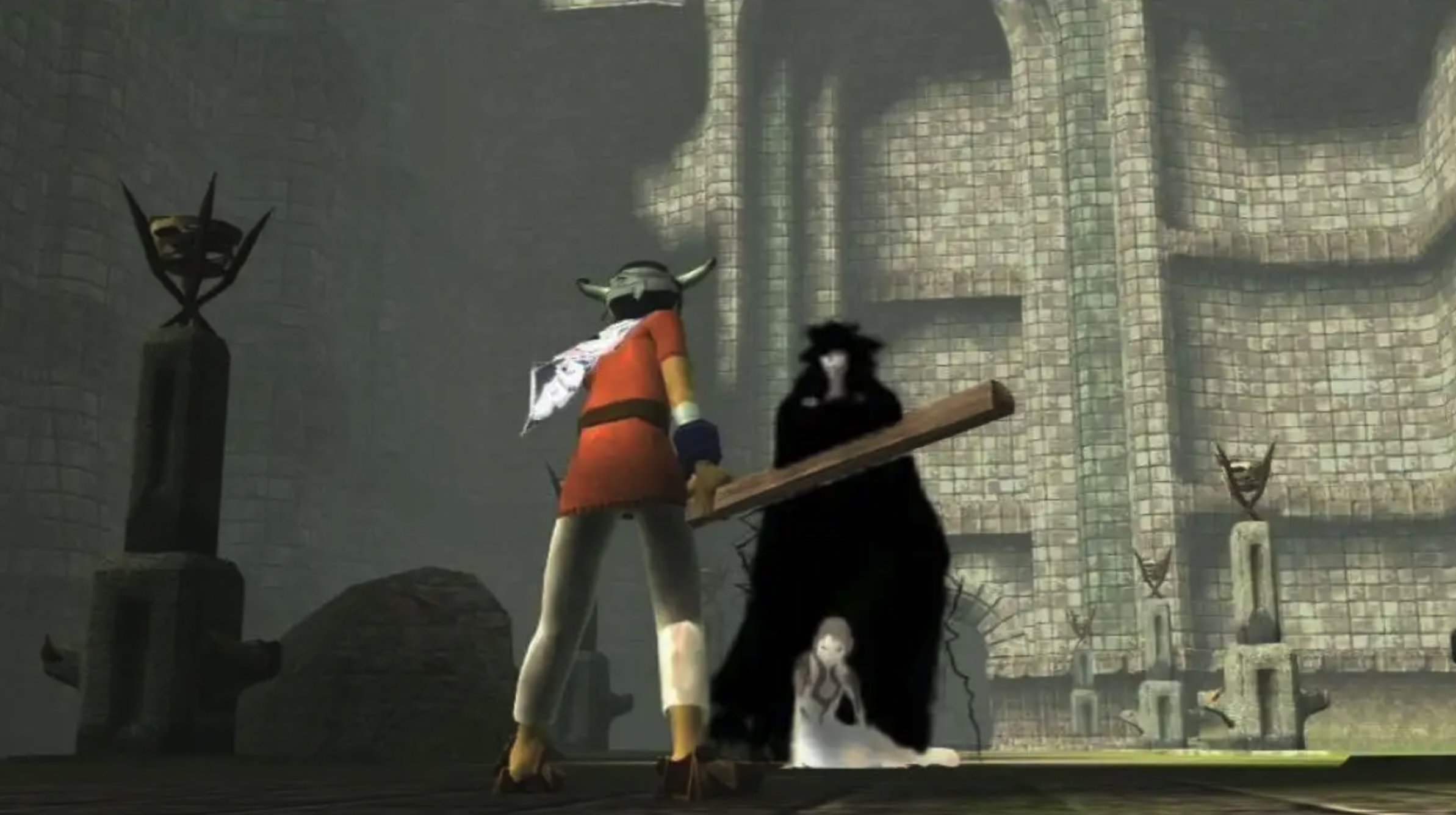
Released in 2001 in North America and Japan, and later in Europe in 2002 — Ico, a horned boy overpowered by a group of warriors, is kidnapped and brought to an abandoned castle to be sacrificed. Fate would have it that he would manage to escape, and befriend a mysterious girl named Yorda. They would become inseparable, and Ico would do everything in his power to protect her.
Developed initially as a PlayStation title, Ico was ported over to the PS2 as the development phase lengthened. It’s impressive to see the familiar landscapes running on an original PlayStation, but there’s no doubt continued development and eventual release on the PlayStation 2 was the correct decision. PlayStation sales were petering out as it neared lifecycle end, with PlayStation 2 sales already understood to be in the region of 10.61 million units in 2001. With the additional computational power offered by the PlayStation 2, more freedom was offered to the development team, especially in regards to Yorda’s AI.
Regardless of the additional power offered by the PlayStation 2, much of the game remained minimalistic. Fighting other enemies is rudimentary at best, with more focus on protecting and bonding with Yorda. Simple fighting mechanics not only adhere to the concept of subtractive design, but they also remain true for the character of Ico. This is, after all, a young boy with limited fighting skills and a simple wooden stick.

What is minimalism?
Minimalism was an art movement established in the late ‘40s/early ‘50s, and is considered a response to abstract expressionism and modernism. For artists that embraced it, there was now an opportunity to create work founded on elegance, simplicity, and utility. Less was finally more. The concept, and mindset, found purpose in other disciplines and industries. Architecture, music, film, literature, and games incorporated varying degrees of minimalism, and continue to do so.
Notable examples include Ernest Hemmingway and his matter-of-fact writing style, or Henning Christiansen’s haunting, almost scant, piano on Min døde hest. Of course, it’s debatable if these two examples are indeed minimalistic, but then, what form of art isn’t debated? With Ico, minimalism was not only evident in how the game played, but in the narrative too:
“For me, it’s not important to tell the details of the story”. “In Japan, there is a poetic expression called a haiku [where] you don’t explain some things in detail and let the receivers understand or use their imagination with what is presented. That lets the receivers make their own story from their imagination, and I think this is also a good style of expression for video games — at this moment.”
Fumito Ueda, Lead Designer and Director of Ico (via gameindustry.biz)
Part of the beauty of Ico lies in its ambiguity, in its ability to convey a cohesive, alluring narrative with little dialogue. As Ueda implied, it’s simply not important to share the details of the story — therefore leaving the player to focus on key aspects of the narrative. Trust is placed in the player to interpret meaning. Much like Hemmingway, Christiansen or Jonathan Glazer’s direction of Under the Skin — the story isn’t poorer as a result of sparse dialogue, it’s richer.
Subtractive design

During the development of Ico, Ueda would employ a technique called “Subtractive Design”. The idea was to remove as many design elements as possible in a bid to reduce distraction, while amplifying core elements of the experience.
You won’t find health meters, point markers, or a HUD with a compass suggesting the direction you should take. Ico features none of these. It’s entirely up to the player to go at whatever pace they wish, and explore. Indicators such as low health, or a character that’s in distress, isn’t depicted as a health meter, but shown though the actions of the character themselves.
Other games may have an army of different enemies, but Ueda found that puzzles were enough, and only one type of enemy was needed. He also removed the health meter, inventory screen, and even background music from his design — all things that come standard in other games.
Via sirlin.net
Periods of extended silence provide space for music to act as an additional signifier — to alert the player when they should pay special attention because something important is happening. For example, silence is often punctuated by music when one chapter ends and another begins. As Claude Debussy would say, “music is the silence between the notes”.
As the player, it’s left up to us to interpret the silence between the notes.
Heal, and the concept of Ma (間)
You might have experienced ma (間), even if you’re not familiar with the term. Roger Ebert had the opportunity to interview Hayao Miyazaki and, wanting to know more about the quiet contemplation that many of his characters often display, asked Miyazaki why this was often the case in Japanese cinema.
“Instead of every movement being dictated by the story, sometimes people will just sit for a moment, or they will sigh, or look in a running stream, or do something extra, not to advance the story but only to give the sense of time and place and who they are.”
“We have a word for that in Japanese. It’s called ma. Emptiness. It’s there intentionally. [claps his hands] The time in between my clapping is ma. If you just have non-stop action with no breathing space at all, it’s just busyness. But if you take a moment, then the tension building in the film can grow into a wider dimension. If you just have constant tension at 80 degrees all the time you just get numb.”
Via rogerebert.com
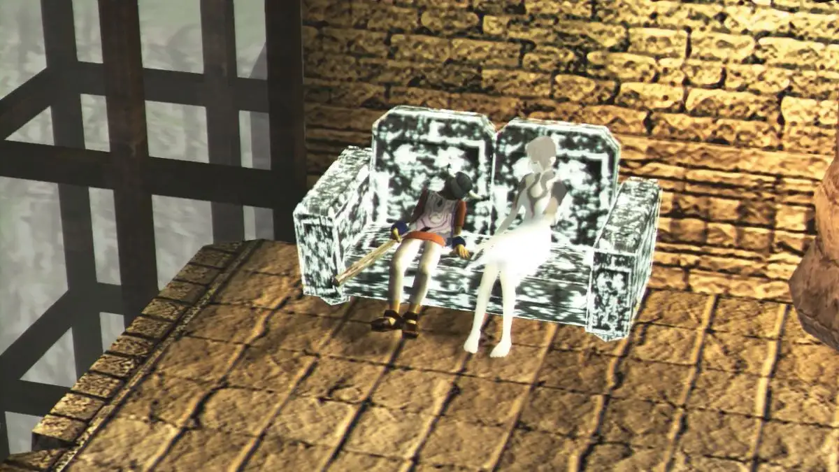
One of Ico’s most iconic moments is when the player chooses to save their progress. Rather than use a traditional floating-point marker, or some sort of beacon, the save point is a mere sofa. Ico chooses to sit and rest, while encouraging Yorda to do the same. It’s a small moment of considered game design that reflects the nature of the environment, and creates a more immersive world by doing so. A moment of quiet contemplation.

When characters are typically allowed small moments to pause in their surroundings, we — the audience — are allowed similar respite. Ico is fearless in its commitment toma (間). It being a distinctly Japanese concept, I often wonder if the idea was too enigmatic for most western sensibilities. After all, the number one selling game at the time of Ico’s release was Grand Theft Auto 3, which is surely the antithesis of Ico.

An experience like nothing else
Considered a defining moment for games, and another step in the direction of showcasing video games as an art form, Ico has left a lasting impact on the gaming industry. Littered with little moments of quiet grandeur, it has lost none of its charm 20 years later.
“Minimalism is about intentionality, not deprivation”
D. Stojanivic.