Through Mist, Light, and Darkness
The fading line between artistry and necessity

I have always wondered what lies just beyond my sight. On a perfectly flat surface, with a clear day and no obstruction, the average person can see at a distance of about 3 miles. There's much that we humans take in by our 3 mile view—it is, in essence, both the benefit and limit of our feeble worlds. Our own perceived draw distance creates incredible effect, though it is easy enough to limit: a copse of trees, a sudden hill, or an overcast day can greatly alter the space of our visual intake. Such is the case with video games; gaming's most infamous fog effects and misty vistas are an incredible combination of technical artistry and blanketing limitations. For the games of yesteryear, fog effects not only amped-up expectations, but they made the impossible possible.
Limn Limitations
In the PlayStation 2 era, many games used "distance fog" to mask distance, cover graphical limitations, and add a sense of scale to increase claustrophobic elements. Fog gradients can do everything from negate the complexity of rendering shadows to simulate light scattering, and in an era of lesser processing power, fog could mask loading times in grand environments. Distance fog allowed rendered features to fade in naturally, reducing polygon count and making it easier for developers to create interesting environments without spending a lot of time on lighting. While the effect was popular on more "realistic" games for the Nintendo 64 and Sony PlayStation, it did not solely exist as a crutch effect for obscuring detail; distance fog became a staple of auteurs and creatives that wanted to purposely keep things hidden until just the right time.
"The fog, which was THE visual effect, the darkness, and camera that runs across the town were all of the things that couldn't have been done in pre-rendered environments. We thought that it would be difficult to best our competition by using only pre-renders. One of the priorities was to make the most of using the real time polygons. As a result, even though the feel may be similar, I think that we created quite a different game."
Interview with Keiichiro Toyama, PSM #19, March 1999
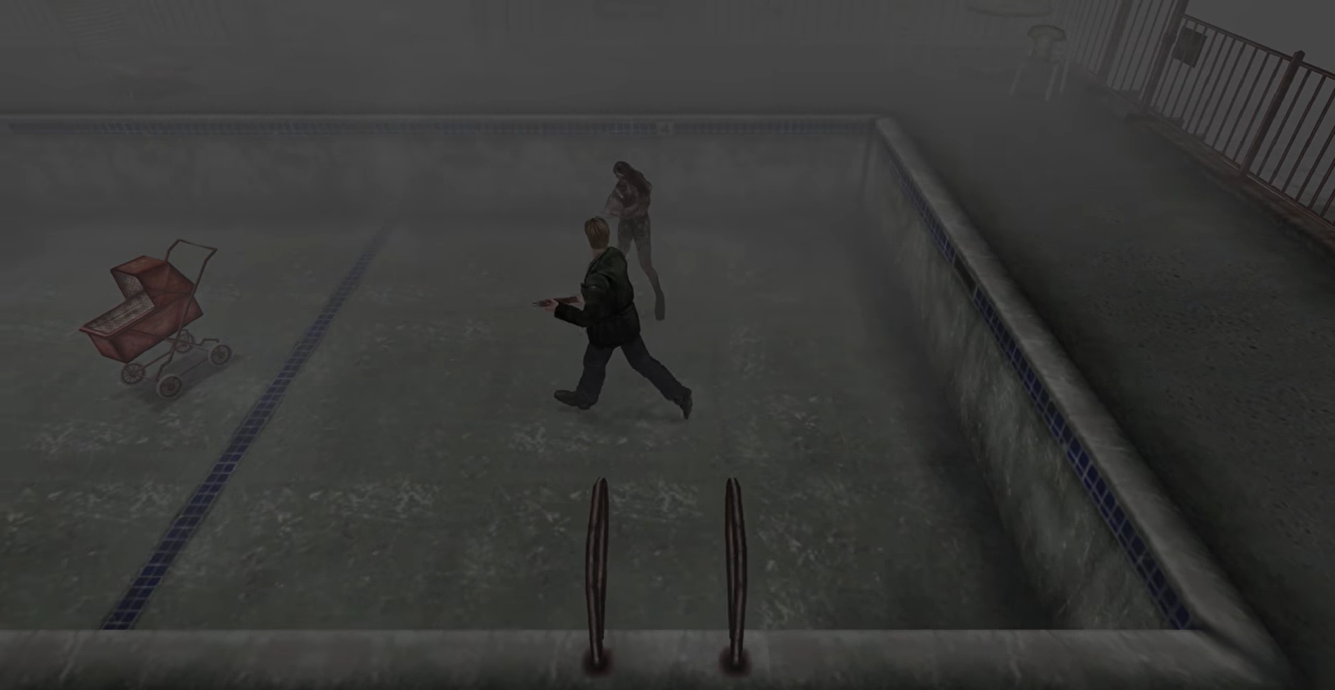
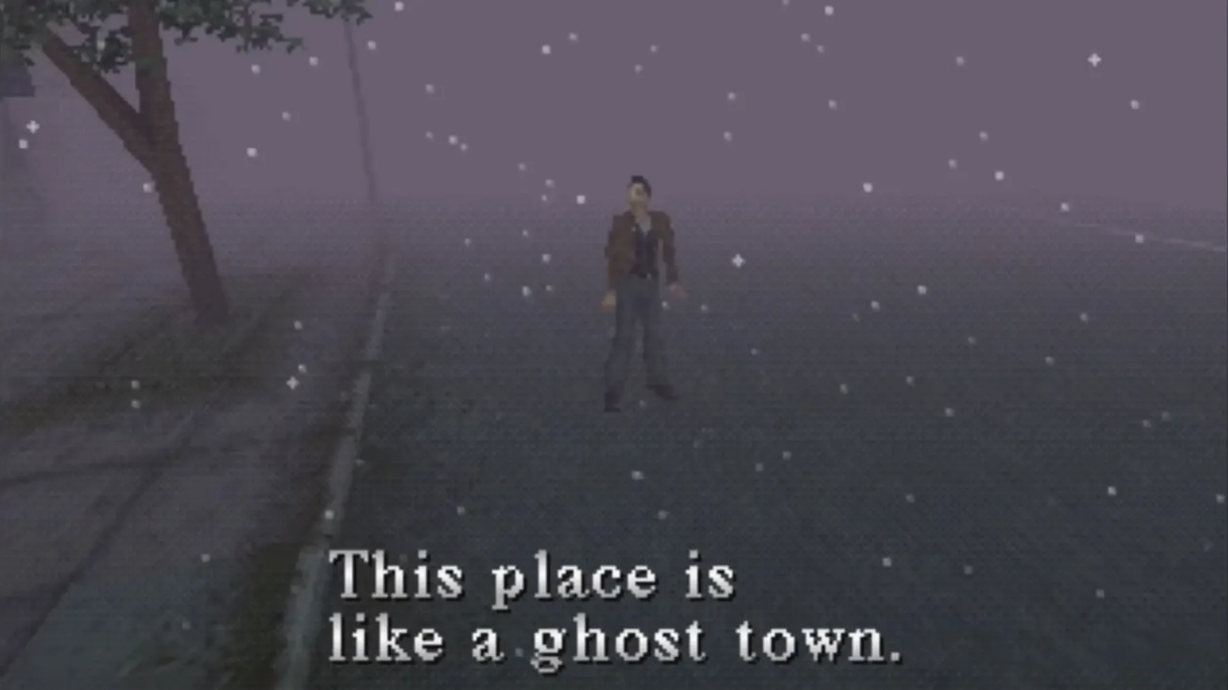
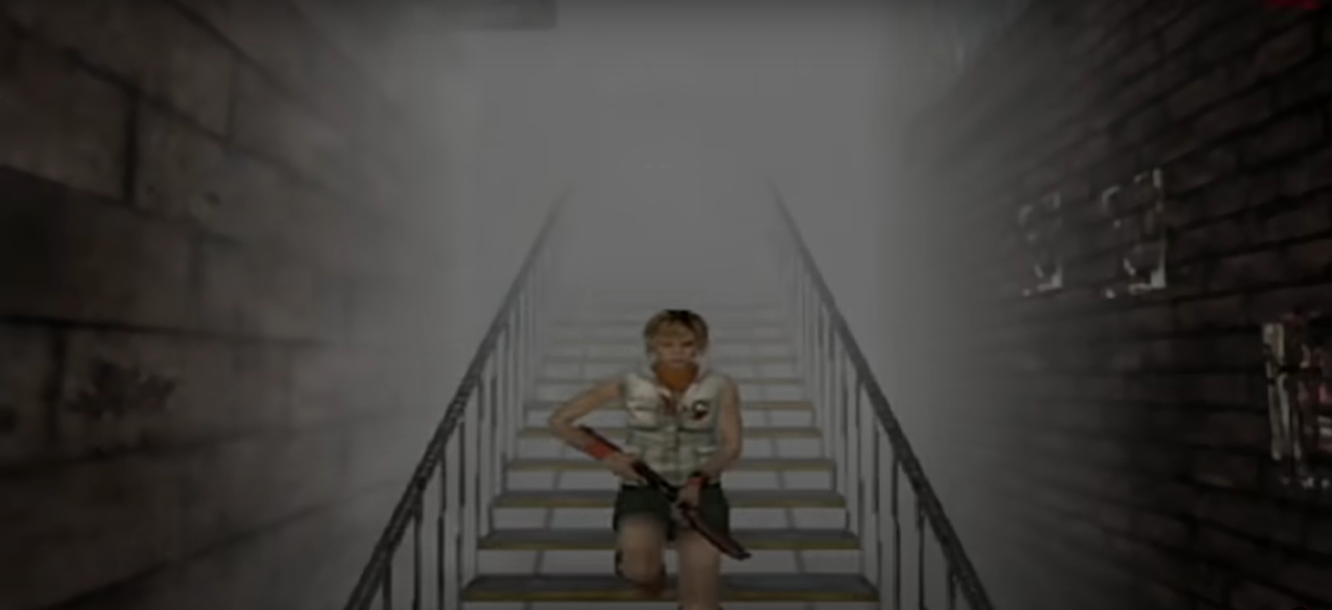
The atmospheric technique of distance fog is famously used in Silent Hill—not just the first game, but throughout the entire series. While the townscape of Silent Hill is not particularly large in the title game or any of its sequels, the fog effect led itself to a natural look and feel in the games that's beloved to this day. Silent Hill 2 and Silent Hill 3 used distance fog to celebratory effect, giving players the sense that they'd entered into an alternate reality whether or not they were in the game's otherworld. Silent Hill's fogging effect was more than a rendering tool, it was a means of feeding fear directly into the psyche of the player.
As music and sound effects ramped up the sense of disquiet, Team Silent could make creatures step naturally through the mist with no need of loading screen separation. Infamously, Silent Hill's HD Collection cut down on the natural fog effects to disastrous results—it seems that players would prefer to be kept in the dark. Like too many elements of horror in the last decade and a half, monsters and scares have been pushed into the light. Modern gaming has largely done away with fog effects, and while this bit of texture may seem arbitrary it evokes the same response as the warmth of a vinyl record.
Castle in the Mist
"The weather has been bright and clear, allowing an unconstrained look at the promised land in the distance; a land seemingly bare of obstacles and therefore preferred to the castle's unpredictable mysteries. [...] In contrast to this, the rocky insides of the cave in the now are trenched in a greyish mist, making the organically-shaped level structures difficult to read."
Games and Bereavement, Sabine Harrer, 2018
I first played the eponymous Ico in 2005, only a few years after its initial North American release. At this point in my life my tastes had yet to be influenced by the internet—all of my purchases were made based on physical gaming magazine reviews, vibes, and my appreciation of elements and aesthetics. Ico had no immediately comparable source. I was a ferocious consumer of the JRPG, and that same trip to the store had secured me a used copy of Vagrant Story from GameStop that was in a clear Blockbuster Video jewel case.
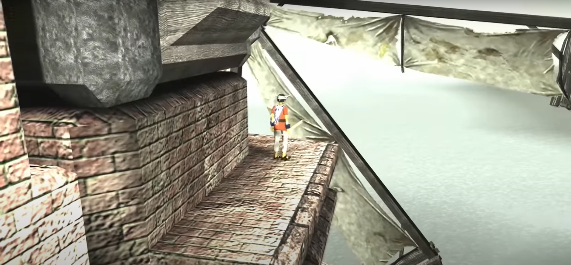
Ico was different. There was no stat screen and there were no items to equip. Unlike other platformers like Spyro and Crash Bandicoot, Ico had no baubles to collect or levels to conquer. The introduction to the game was stark, and quiet. Birds chirped out of view in a verdant wooded landscape. Horses clomped along an unfinished road. A boy, blindfolded, was carried into an ancient ruin on horseback. Its details were small but carried the weight of a sledge: the boy had horns, the castle was on stone stilts hundreds of feet above an undisturbed ocean, and the entire world was painted in grey.
As Castle in the Mist begins to play, we see Ico stand in emulation of a statue. This boy with horns is important, yes, but his infinitesimal size cannot be overlooked against the imbalance of his surroundings. He stands beneath an infinite grey sky, the castle wreathed in splotchy fog. We are granted cinematic passage into the castles halls, foyers, and avenues; as the song continues to pluck out its melancholy notes, flames flicker in interspaced sconces beneath decorations and filigrees of unimaginable influence. This introduction scene returns again and again to the grey skies, even as Ico is intercut exploring the brutalist brickwork of the unforgiving castle (inspired by the works of Giorgio de Chirico). Chains hang from the ceiling. Empty cages herald the possibility of imprisonment. As Ico and Yorda walk along hand in hand, grey fuzz flecks across the screen, the graphical limitations of the PlayStation 2 melding beautifully into the rustic, ancient décor. Blessedly, as if coming up for air, the introductory video grants our tired eyes the view of a single tree that's bright and emerald. We are not hopeless in the grey.
Ico is a game of dimension. The path forward is never simple, and guidance through the castle is limited. With every conquered room, Ico both ascends and descends, unwanted by both heaven and hell. Yorda, ever at his side, is not his only constant companion—we are never far from the touches of grey. Fog wreaths the castle beneath a mottled grey sky as roaring waterfalls spit forth gouts of mist. Here, fog and mist are not only technical features, they are the identity of the game itself. Team Ico sought a permanent melancholy as a stand-in for the game's mostly non-verbal story, a way for the player to retain a constant sense of dread. Where the fog effects in Silent Hill curtain the consistent possibility of horror, the mists in Ico frame the story by a claustrophobic loneliness. Like being lost in a fog, this journey's dimensions are corrupted from the start—this effect and texture are dangerous, and real.
Lost in the Fog
Occasionally, art direction takes a step back in favor of the shine of modern design and the flex of budget.
In the Shadow of the Colossus, the world itself feels as if it came fully-formed from the fog. While many players may be more accustomed to the effects of the recent remake, the original Shadow of the Colossus employed its sense of dread and scale by utilizing features of distance fog that had never before been attempted. The eeriness of the Shadow of the Colossus is accomplished because of how the team blurred the game's brightness and color in favor of more obscured effects. Steam, fog, and smoke particles are sampled, and silhouettes are blurred due to how the PlayStation 2's graphics scattered light. By blurring light and particles through the distance fog, polygons were softened and angled textures were given deceptive detail. It is because of these effects that the original game still looks a certain way projected through personal memory—the way the Shadow of the Colossus looked on your old CRT, on original hardware, is much in the way you recall it.
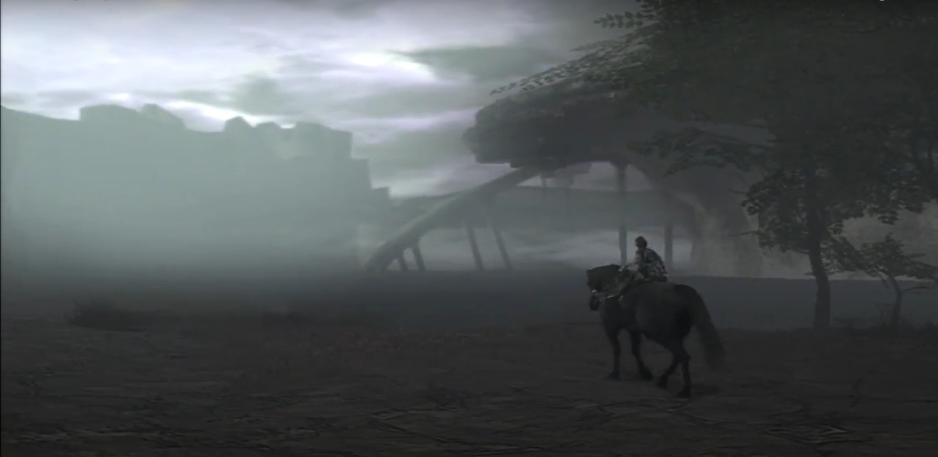
The spaces in video games are not true physical spaces, but the emulation of space itself. We meet video game graphics halfway—effects can only do their job if we entertain the notion that these virtual spaces are real. While the best video games marry both art and architecture, we are only ever seeing the representation of this physicality. What is shown—or obscured—rests in the imagination. A remaster or remake, then, is a representation of a representation, and every time we funnel something through the sieve we lose the flavor and the grit. That's not to say that Bluepoint's PlayStation 4 remake is not beautiful, but that in playing it players are reminded that the initial fog effects may have been more than stand-ins for loading screens, they were an aspect of the world itself.
Modern game design feels almost predicated by the thought that players should never feel any sense of discomfort. While disorientation is not everyone's cup of tea, that is undoubtedly the effect of fog, mist, and other obscuring effects. In these older titles, where their technical limitations were creatively sidestepped, a certain painterly beauty may be observed. Long before dynamic lighting engines were the norm, games such as Vagrant Story or Xenogears evoked their beauty through painstaking detail that emulated lighting direction. Vagrant Story's gorgeously illuminated characters in Lea Monde are coveted two decades later, and all because the team did their best to work within the bounds of what was possible.
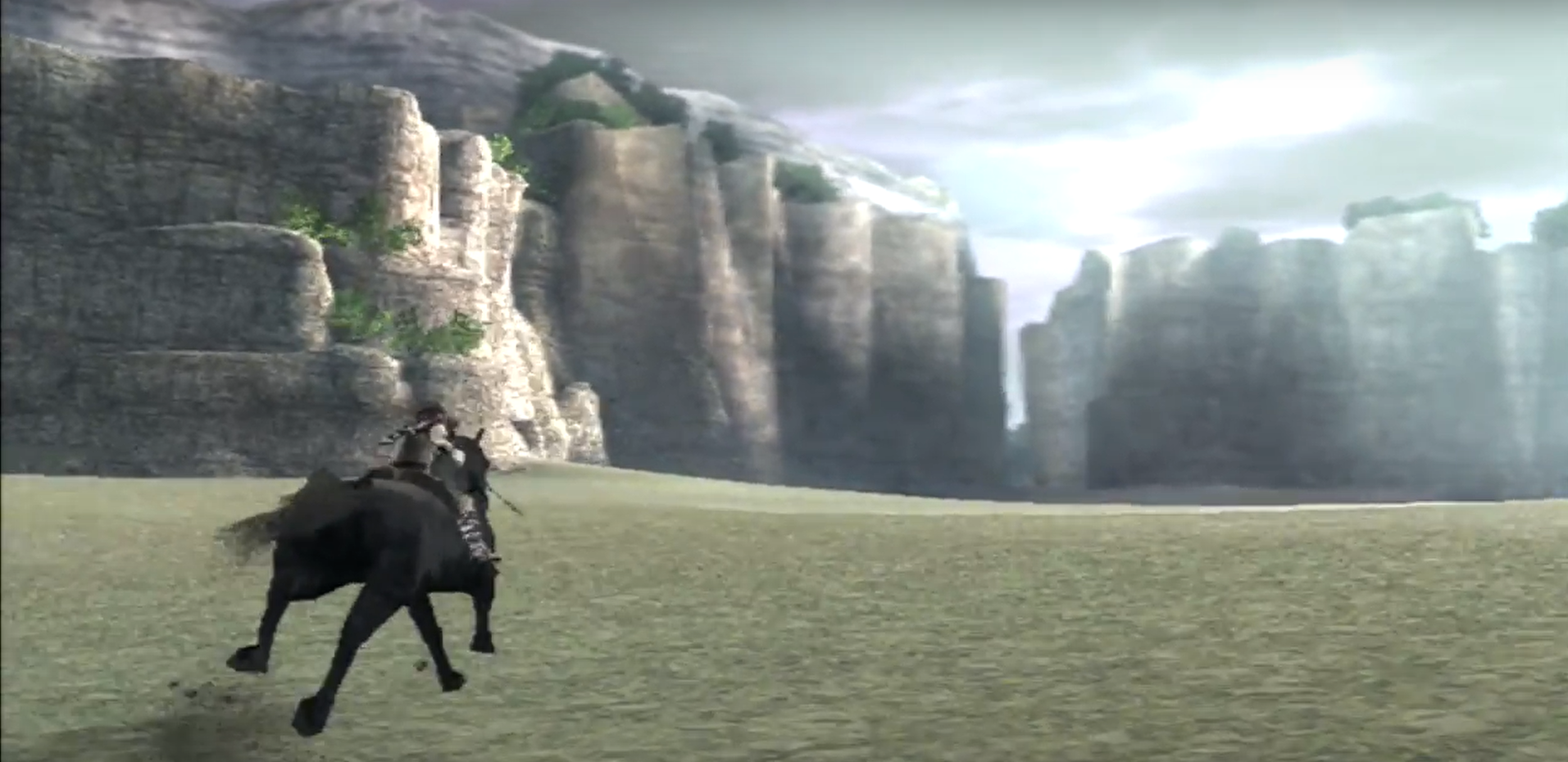
As Wander and Agro race across the Forbidden Lands, fearlessly spearing the dividing fog, what landscape parts for them is only ever a short distance away. Through the greenish glow and soft haze of the eternal fog, players are granted the endless possibility of lush forests, craggy mountain faces, Eden-esque trees, and thundering Colossi. Again, this distance fog is treated not as a technical limitation or a blanketing elements for software running behind the scenes—it is a weapon of storytelling, a memorable power that grants identity to a game now 17 years old.
Shapes from a Distance
The artistry of an obscuring effect such as a distance fog can only have a lasting impact if the object of its concealment has value. For both Silent Hill and the works of Fumito Ueda, the architecture that hides behind the grey are granted power because of their mystery, shape, and design. The ruined town of Silent Hill might only be an Anytown, USA in truth, but it becomes infinitely more interesting and inarguably more valuable because of the fog that wreathes it. While the castles in Ico, Shadow of the Colossus, and the Last Guardian have indeterminable origin, their mysterious are deepened by the blue-green mists. This is because the spaces here are allowed to flourish in the depths of our imagination—they gain power because of what we fear to understand.
"Knowing that I’d never get to wander the overgrown streets or gaze up at the vine-covered skylights caused an almost physical sense of heartache. I remember feeling similarly as a kid, when I first learned about the Colossus of Rhodes and the Lighthouse of Alexandria, and then of their subsequent destruction. Fictional or not, the commonalities between these structures that captured my imagination are clear; driven by artistic ambition and/or hubris, humans created buildings that eventually proved to be as impossible as they appeared."
Shapes in the mist, Jacob Geller, 2017
While not utilizing as much of the fog effect, Dark Souls proves that obscuring distance improves the vastness of the world. Where miniature polygons and incomplete renders dot a distant and unexplorable horizon, we are made to believe that the world is greater than the sum of its areas by these faintly concealed locales. I quite fondly recalling standing on so many precipices in the original Dark Souls on PlayStation 3 (and Demon's Souls before it) allowing my imagination to pick apart these vistas. Even if someone could unhook the game's camera and show me the truths of these far away spaces, I do not wish to know them. There is nothing in that knowing that could possibly heighten my internal interpretation of what might await in those craggy peaks, silhouetted castles and stormy skies.
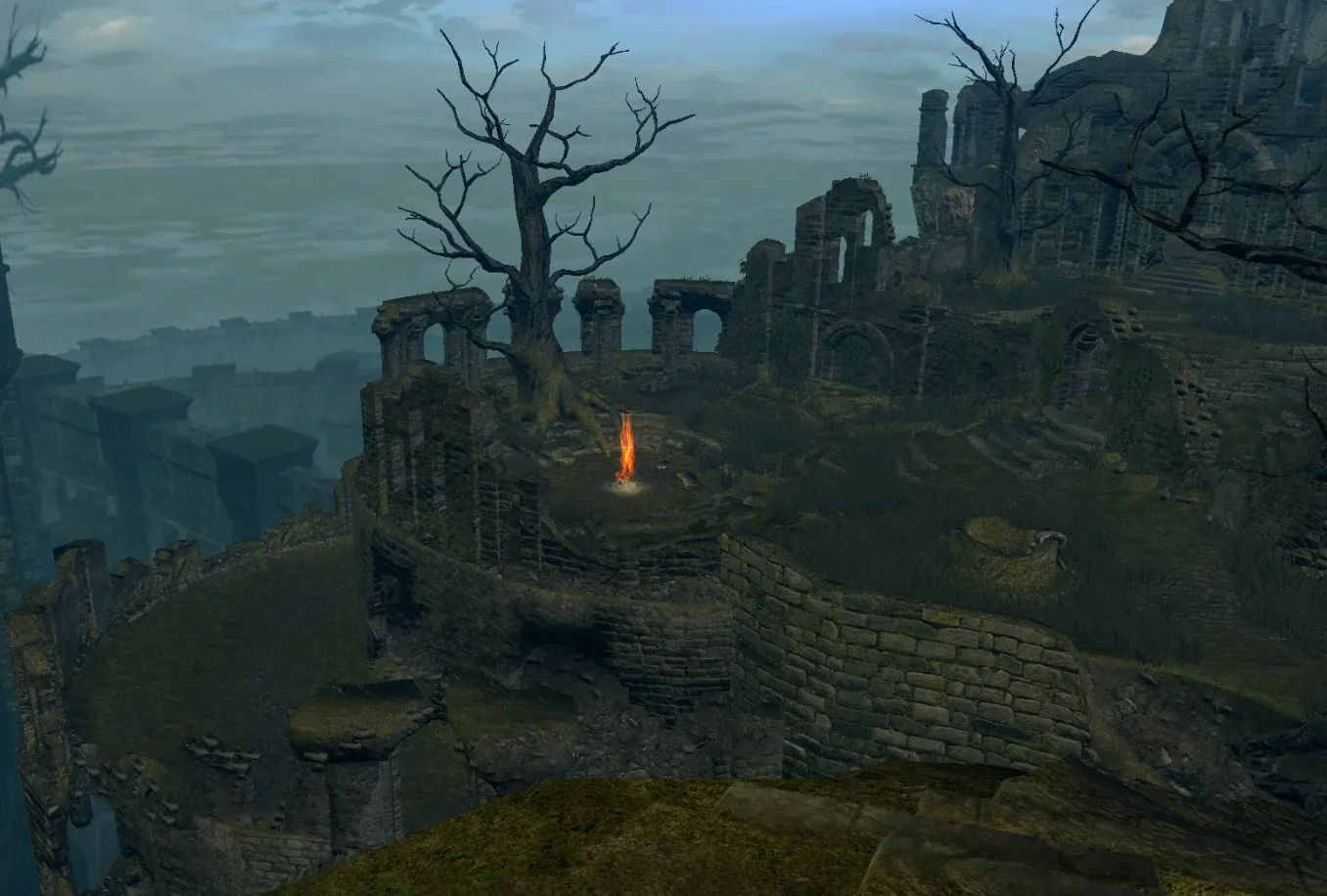
In a medium based entirely on its visual fidelity, it may seem odd to wax poetic on what is kept from my field of view. It's precisely in these intersections of clarity and mystery that ancient gaming architecture thrives, and why returning to many of these older titles still turns my heart in such a way. It's not about what the fog is obscuring, but why it's obscuring it at all. I'm knowledgeable enough to face the technical limitations of yesteryear and see their workarounds for the artistic celebrations they really were, even if the initial development may have been a grotesque struggle. As I stand above a cliff and look down on a mist-strewn valley, whatever lies beyond the fog can never compare to the fantastical yearning of What Could Be.
Like the man in Caspar David Friedrich's painting Wanderer above the Sea of Fog, the unknowns of what I observe grant terrible power to the imagination. I feel nostalgia for the limitations of old consoles and their effects because there is a piece of me that still believes it might be possible that something unexpected can step through that terrible grey.
