Applying Usability Heuristics to Undertale
Exploring what Undertale can teach us about minimizing the user's memory load through the lens of the 10 usability heuristics

In this series about the 10 usability heuristics, I have covered five heuristics on four different games:
- Visibility of system status on The Witcher 3
- Match between system and the real world on Her Story
- User Control and Freedom on Baba is You
- Mass Effect: How to Indoctrinate Users with UX Consistency
- Applying Usability Heuristics to Animal Crossing: New Horizons
This article is about Undertale and the sixth heuristic: recognition rather than recall. Make elements, actions and options clearly visible to users to minimize memory load. Do not force users to remember information, all information needed should be available and easily retrievable if necessary.
I will talk about how Undertale shapes its encounters according to the enemies (personality, story, etc.), allowing players to make quicker and better-informed decisions and also giving the game space to create unique and fun encounters , opening space to creativity and enriching the soul of the characters.
Recognition Rather Than Recall
Interfaces should help users to recognize, to reduce the amount of cognitive effort required, instead of recalling. Show clearly things users can recognize, offer help in context and reduce how much information you ask from them (or make them remember).
Why?
Human beings have limited short-term memories, extra context helps retrieve information from memory. Forcing users to recall can be quite frustrating. You might even find users taking notes and using other interfaces to store the information they need. This is not only frustrating and time-consuming but you lose your users’ attention for some time.
How does memory work? (super simple version)
Memory is organized in chunks : basic units of info interconnected via association. You can describe each chunk by its activation - how easy or hard it is to retrieve it from memory. Your birth has a high activation because it's easy to retrieve the info, but your phone number has a lower activation.
As you can already imagine, activation can be influenced by: practice (how many times was used), recency (how recently) and context (what is present at the moment).
Context is the key to help retrieve information from memory : if something in your focus of attention is connected (associated) to a chunk in your memory it activates or makes it more active.
Recognition and Recall
The number of cues involved to help retrieve a memory is lower in recall and bigger in recognition.
Recognition: Is this article about games and the sixth UX heuristic?
Recall: What is this article about?
Recognition cues spread activation to related chunks of information ; you can easily answer the question. You just need to recognize if the info is correct and in the second question you need to recall from memory (or go look for the info) to be able to answer.
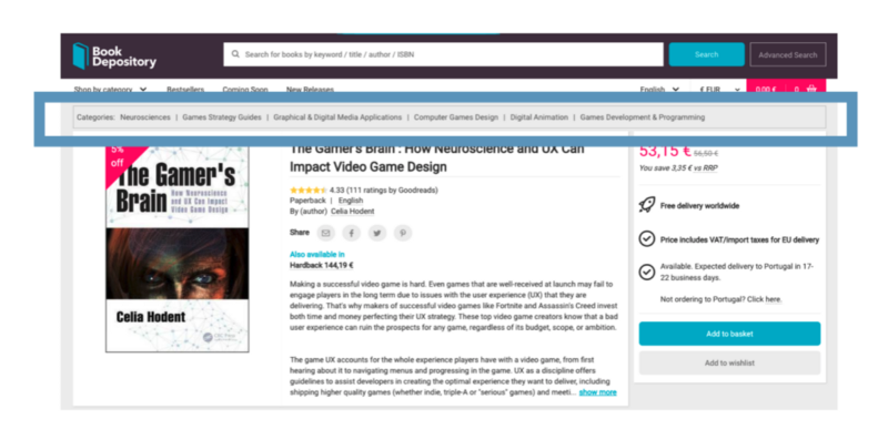
Example of recognition: Menus and categories help users recognize what menus and items' categories are available. In the example below you can use the menu but the interface also gives an extra: a group of categories related to the book you are viewing.
Example of recall: When you need to remember your password to login into a site. Everyone has different strategies to help recall — take note, use the same password, passwords related to the software being used, etc.
How can we help recognize?
The big rule is to make information and available functions (buttons, navigation, other actions and elements) visible and easy to access.
Remember how your memory is activated and you can understand how easily users can retrieve information from memory:
- How often have they encountered the information?
- How recently they have used it?
- How much is related to the current context?
Putting effort into context-rich interfaces and promoting recognition helps users complete their tasks with info and tips about functionality.
Undertale, and how to recognize your enemy and decide your path
Undertale (2015) is a role-playing game created by the indie game developer Toby Fox. The playable character is a human that falls underground into a different world, separated by magic, that is ruled by monsters. The human needs to find a way back to the human world. To do so, the player needs to overcome a series of encounters with monsters or be trapped in the monster world.
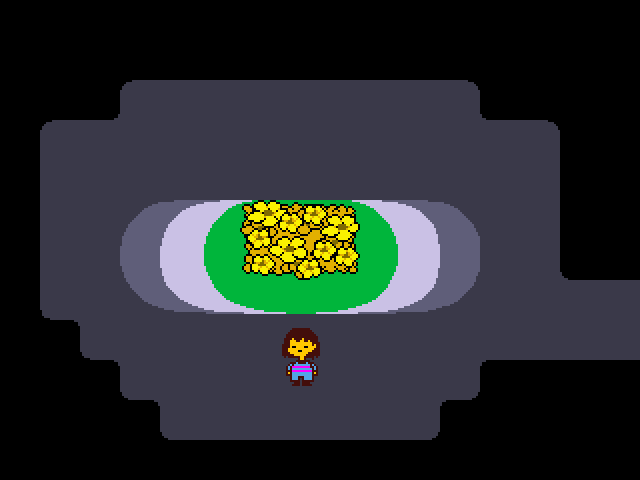
While progressing the story, it's possible to explore the Underground. There are a lot of monsters the player can encounter but not necessarily fight. Just like it says on the game's Steam page: "Killing is unnecessary: negotiate out of danger using the unique battle system.". It's possible to kill, flee or befriend a monster. The way the interaction is played and the final choice of each interaction impacts the plot and the progression of the story - the player's morality not only allows for different endings but can also change how it's possible to interact with the world and with other monsters.
Encounters
Random or plot-related encounters, as they are known in Undertale, are "battles" with monsters. It's possible to FIGHT (fight the monster), to ACT (perform actions that can change the monster's mood), to use an ITEM or show MERCY.
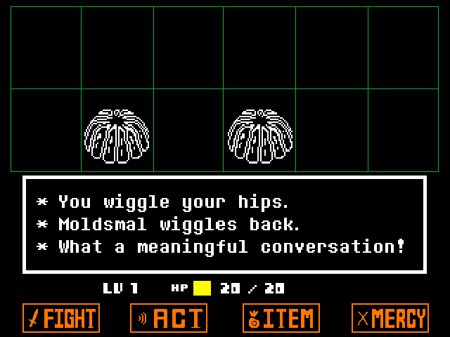
The image above shows the UI of a battle. Let's take a closer look at it to see how it can be shaped to the different monsters, their abilities, moods and attacks.
Monster animation space
On the top, on the green grid are the monsters and they are animated to show the current mood. Some specific monsters have more complex animations (or nothing at all).
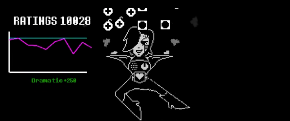


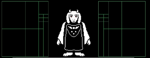
Different ways to explore the monster visuals. Source: Author.
White text box
Below the grid, there is a white box with narrative text by default. When the player triggers an encounter the battle mode opens with a text that introduces the character in a funny way (if not an important boss battle) and gives cues about the nature of the encounter.
This box is where most of the fun happens. If the player clicks FIGHT, the box will adapt to the attack. If the player chooses an ACT or after an attack, the enemy turn will adapt to its attack/reaction. It turns it into a Bullet Board where the soul of the player is trapped.
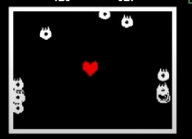


Different attacks from monsters not only change the shape of the box but also the content. Source: Author.
The visual adaptation of an image (video, animation, etc.) to a character, moment of the story and mood is something very common. It's used in most mediums that include a story with a visual way of conveying it. The interesting part of Undertale is how this visual adaptation also occurs on the interaction and how each monster has not only their own image, animation and text but also UI for attack or enemy turn and the adapted elements inside it:
For example, an attack can happen only inside the box or the animation can perform an attack that impacts the box where the heart with the soul of the player is. The box also adapts to the attack of the player. You can see on the image above how different it might look.
This of course also has an impact on the action the player has to do to keep his soul intact or to be successful in an attack. Just looking at the boxes above (and even without animation) you can understand how different the interaction is. The first one has falling items that can hit the character's soul, you need to escape them, the second one has a horizontally moving background with bone obstacles that can hit you. Even without doing anything, the player can calculate that it will most likely move more horizontally (or in different directions) on the first and mainly move vertically on the second.
Another possible action inside the white box is to select. If there is more than one monster, the player can select one to interact with; when clicking ACT the player can select different options of interactions that are possible with the specific monsters; when clicking ITEM it's possible to select an item.
Current status of the character
Just below the white box, the player can see her character name on the left, the level and the HP.
The 4 button options
On the bottom of the screen, the 4 possible interactions are inside buttons signifying there are the actions available to the player. Selecting them is going to change the interaction possible. The icons give the clues needed to differentiate FIGHT and ACT. A sword and a speech tell how different the interaction can be. Knowing it's possible to be merciful, it's really up to the player to make the decision between the 2 different routes...
Recognize the monster and make a decision
Most interactions are bullet patterns shaped in different sizes, amounts and they move in different directions and speeds. Every monster has its own body, mood, ideas ... their personality shapes how the battle UI is presented to the player, not only the text and the visuals.
The players don't need a new guide to understand the differences. From the way the character's soul moves, the animation when the attack begins and the shape of the elements on the screen, the player can quickly attack and dodge attacks with success. The player doesn't need to memorize a combination of attacks or best moves. Recalling and making the effort of memorizing specific moves or battles does no good; the player also needs to adapt to what is given to her.
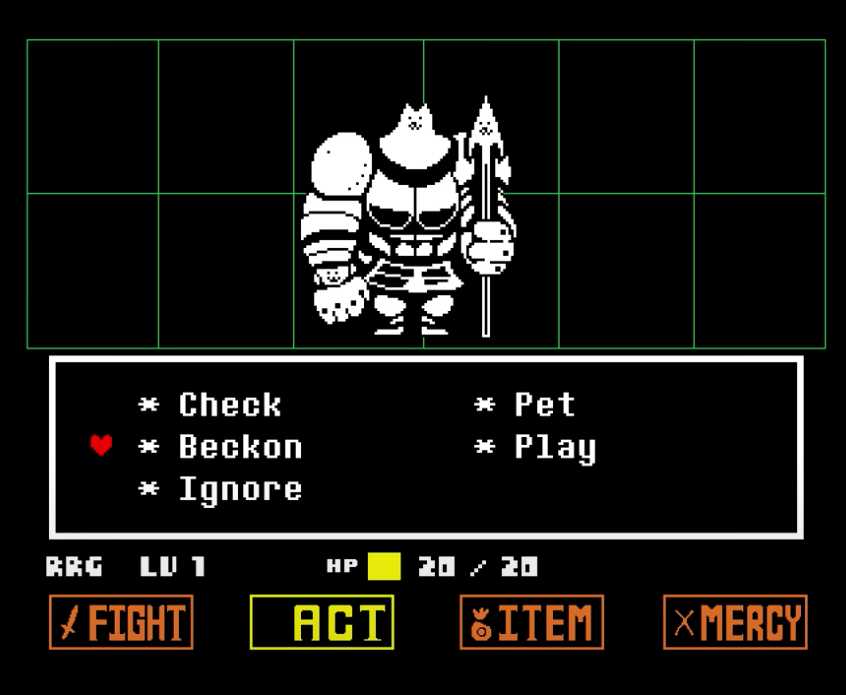
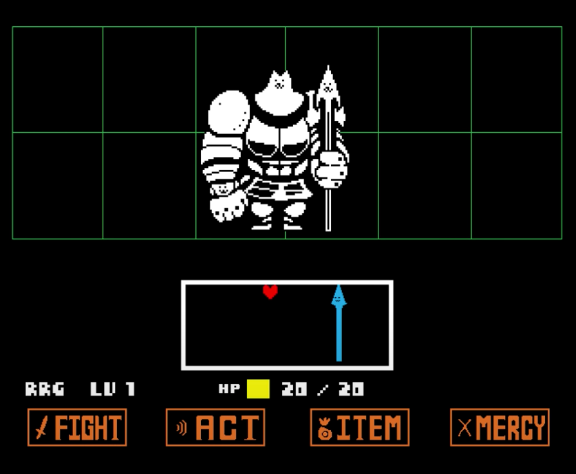
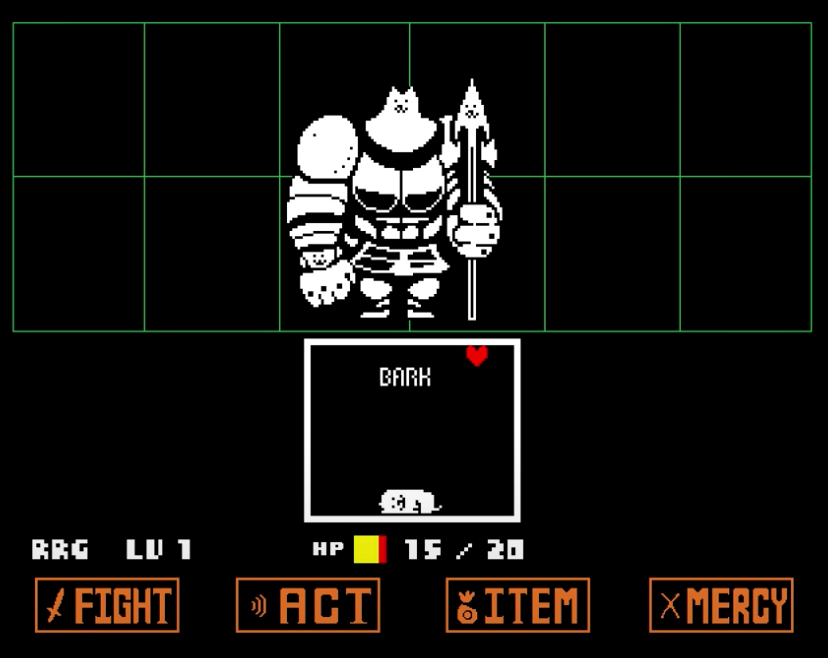
The way the character talks and acts also gives you cues to what might be the best option when you select ACT. If the monster is a Greater Dog with big armour but a small tail that is always moving, probably petting is a good option, not the perfect first option but you can try to win its heart before petting. If the monster is a vegetoid, the options are "Dinner" or "Devour" and you can tell the potential results just from those 2 words...
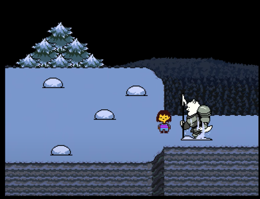
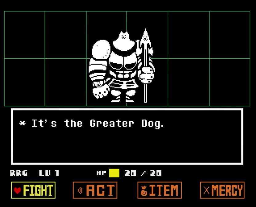
Source: Author.
On the image above you can check the interactions with the Greater Dog. In the second image, the dog looks frightening but has a small tail that is constantly waving. Select Act the interactions possible are the usual for a dog. If the player selects interactions that slowly grow trust with the dog it can change its mood from using his spear (4 images) to laying on the floor and barking. He can even be so happy that lays on top of you, restricting your movement.
Final thoughts
Adapting the interaction to characters can be tricky but doing it with enough visual cues helps the player recognize the possible interactions and make a decision.
In Undertale, the story and the characters tell the player what is possible or not to do. The player just needs to focus on the challenge on the screen. This way of shaping the UI, taking a very simple screen break into 4 parts and playing with it to tell a story in a funny and emotional way is incredible and always makes me wonder about how simple structures can be used in such a powerful way.
When the story and characters are the centre, the soul of the game (creativity) does the rest. It turns each encounter into something fresh without burdening the player with the need of memorizing a thousand moves, button combinations and tricks - the player only needs to work with what's in front.
This freedom comes at a cost: it's not only the interaction that changes with the monsters, but the small decisions on every player interaction can also change the way the monsters see him and determine its path to reach its goal...or not.
